
Colors & Theming
You can match the POS Cafe online ordering menu to your brand entirely from the theme editor, with no code. This page explains how the colour system is layered so you can get predictable results and understand why some swatches are left blank.
Two tiers of colour
Section titled “Two tiers of colour”The colour settings come in two layers, and they work together:
- Base colours: the core palette. These have real default values and define most of the look.
- Element Colors: optional per-element overrides. These are blank by default and inherit from the base colours until you set them.
Base colours
Section titled “Base colours”Found under the Colors heading. These drive the overall palette:
| Setting | What it affects | Default |
|---|---|---|
| Primary / accent color | Buttons, highlights, active states (e.g. the selected collection tab) | #1F2937 |
| Button text color | Text and icons on top of the primary colour (e.g. button labels) | #FFFFFF |
| Surface color | The surface behind the nav, cart and inputs | #FFFFFF |
| Text color | Body text | #1F2937 |
| Border / divider color | Card, divider and chip borders | #E5E7EB |
Element Colors (overrides)
Section titled “Element Colors (overrides)”Found under the Element Colors heading. These let you fine-tune individual elements. They’re intentionally left blank, which the theme editor shows as an empty swatch labelled Select.
Here’s what each one falls back to when left blank:
| Element setting | When blank, it matches… |
|---|---|
| Card background | The page background |
| Card border | The global Border / divider color |
| Navbar background | The product cards. Only shown, and only used, when Show section background is off. |
| Menu link color | The Text color (or the muted text colour for the Plain text navigation style). Sets the colour of unselected collection links. |
| Cart panel background | The page background |
| Cart button background | The product cards |
| Cart button border | The global Border / divider color |
Why blanks are powerful: the cascade
Section titled “Why blanks are powerful: the cascade”Leaving an Element Color blank means it follows your base colours. Change a base colour (say the Border / divider color) and every element left blank updates to match automatically.
The moment you put a colour into an Element Color, that element is pinned and stops following the base colours. So set element overrides only when you specifically want an element to stand apart.
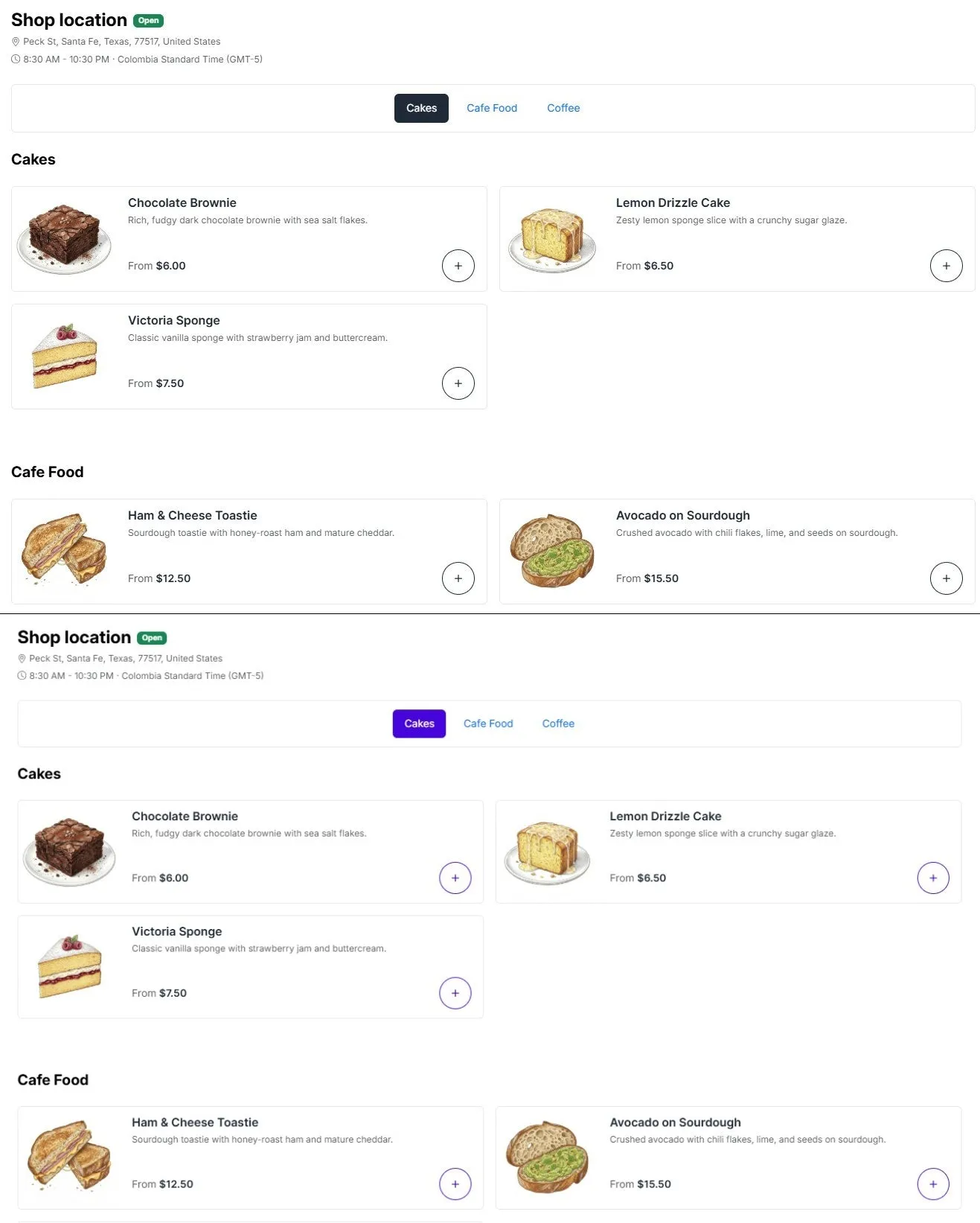 Changing one base colour cascades across the menu.
Section background vs Navbar background
Section titled “Section background vs Navbar background”Two background settings interact with the Show section background layout toggle in the Layout section:
- Section background (on the Layout section) wraps the whole menu in a contained, rounded panel. When it’s on, you can set its colour with Section background color.
- Navbar background only appears when Show section background is off. In that layout the collection tabs become their own card, and this setting tints that nav card. Leave it blank to match your product cards.