
Theme Editor: Layout
The Layout settings on the “POS Cafe Online” block control the structure and spacing of the POS Cafe online ordering menu: width, how the location header and navigation look, density, and corner roundness. Open them in Online Store → Themes → Customize.
Content width
Section titled “Content width”Controls how wide the menu is on large screens:
- Full width: spans the available space.
- Centered: a comfortable centred column (default).
- Custom max width: set your own maximum.
When you choose Custom max width, a Custom max width slider appears (960 to 1800px). It only shows for the custom option.
Break out of theme container
Section titled “Break out of theme container”Off by default. Turn this on to stretch the ordering app to the full page width even when your theme’s page template is narrow or centred. Use it if the menu appears squeezed or pushed to one side.
Show location details
Section titled “Show location details”Toggles the location header (name, address and opening hours) at the top of the menu. On multi-location stores, a compact “Change location” link is kept either way so customers can still switch.
Show section background
Section titled “Show section background”This toggle switches between two looks:
- On: the whole menu sits inside a contained, rounded section panel. You can colour it with Section background color, which appears just below this toggle. Best with a Centered or Custom content width.
- Off: the menu sits directly on the page, and the collection tabs become their own nav card for definition. In this layout you can tint that card with Navbar background, set under Element Colors (see Colors & Theming).
 The two layout styles.
Menu navigation style
Section titled “Menu navigation style”Choose how the collection tabs look:
- Pills: rounded, filled active tab (default).
- Underline: an underline under the active tab.
- Plain text: minimal text links.
- Buttons: bordered button-style tabs.
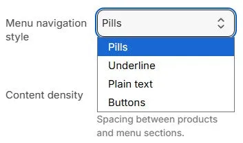 Navigation style options.
Content density
Section titled “Content density”Sets the spacing between products and menu sections (and the nav card spacing): Compact, Comfortable (default), or Spacious. Compact fits more on screen; Spacious gives a roomier feel.
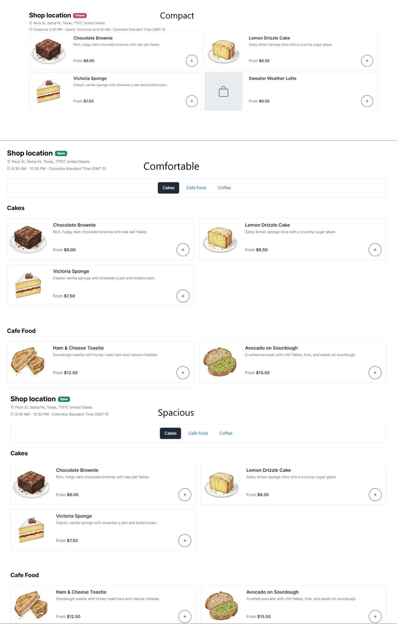 Density options.
Corner radius
Section titled “Corner radius”The roundness of cards, buttons and inputs: Sharp, Small, Default, Rounded, or Extra rounded. This applies consistently across the menu.